• Hello!
  • Shop
  • License This!
  • Portfolio
  • they said what?!
  • Press
  • Contact
  • New Products
  • Journal
  • Life List
  • Links

Marissa Huber

I Create Playful Art to Infuse Sunshine into Your Life

  • Hello!
  • Shop
  • License This!
  • Portfolio
  • they said what?!
  • Press
  • Contact
  • New Products
  • Journal
  • Life List
  • Links

Lines and Chevrons

I keep blank watercolor cards and envelopes on hand at all time so that I can easily whip up cards when I need them.  With some major life events happening for a few of my friends (both good and bad, which is when blank cards come in handy for your heartfelt messages), I needed to either head over to the card store or make a large batch quickly. I went for the latter.  For quick and easy, nothing beats watercolors in my opinion.  You just need a bit of water, paper and a brush.  Having worked in a wonderful small art store during college, I can go on indefinitely about art supplies, but I'll save that for a later post.

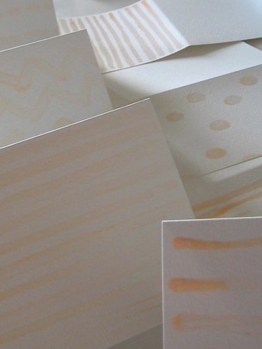
In this case, I used masking fluid, which is like a glue that covers paper that you don't want the paint to touch, and you pull off when the paint is dry. I'm usually a frenetic sketcher who uses lots of crazy black lines, so it was good to experiment with white spaces to change it up.

Masking Fluid Production Line

After having the stunning cover image from Sarah Midda's South of France Sketchbook in my head for days, I decided to attempt my own loose interpretation with various palettes.

Masking Fluid Lines

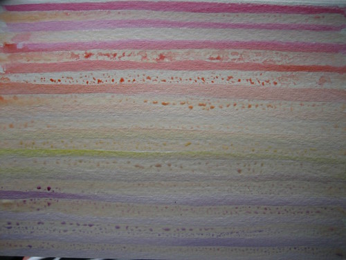
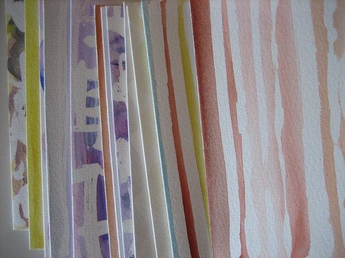
Those who know me won't be surprised that I had to include a rainbow palettes gradating from color to color.

Rainbow Stripes

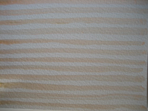
Oddly for me, since the palette above is my nearly neutral with the bright hues I love, I found myself enjoying how the peach masking fluid looked.  I particularly found myself drawn to the burnt umber and colors of the Utah landscape shown below.

Utah Colors

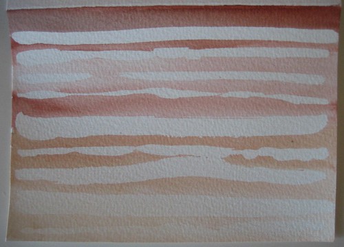
I also tried to edit myself with the color choices. This messy chevron card was one of my favorites.  It now has a home with one of my dearest and oldest friends in Georgia.

Messy Chevrons [After]

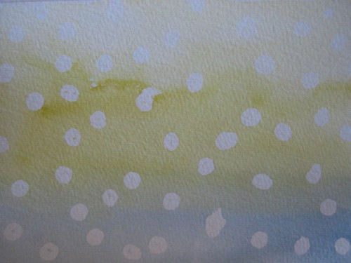
This polka dots card ended up being much cuter than I thought it would be.  When it comes to watercolor, you could never get the even washes of colors around the white areas without the masking fluid.

Polka Dots

I did some batik inspired cards, and a flowery one that I sent to the sweetest 11-year-old friend of mine in North Carolina to thank her for a lovely necklace she made me.

Full Set

This ended up being a lot of fun, and I achieved the result I intended; loose drawings and lines, different color combinations, some love thrown in to the end users and a bit of hot pink, but in check.

tags: color, illustration, watercolor
categories: Uncategorized
Monday 09.19.11
Posted by Marissa Huber
Comments: 3
 

Hot Pink Fixation + Schnabel Inspiration

Hot pink makes my heart skip a beat. It's one of those colors that makes me immediately like whatever object, furniture or piece of art it's on. After reading Shannon Leith's post on color today, I see I'm not the only one. Well, us, most people in the 80s and definitely Julian and Olatz Schnabel. I came across Olatz Schnabel's bedroom in last September's House Beautiful. The room, the custom headboard, the sheets she designs and unique color sense were all inspiring, but even more so was her vintage hot pink rug.

Olatz Schnabel Bedroom via House Beautiful September 2010

The Schnabel's rug and this brilliant pink one from Living Etc. magazine below are the two rugs I measure all vintage dream rugs by.

Living Etc. January 2010 House of the Month

The closest I will get to my dream rug for now is owning it in my sketchbook. That suits me for now!

Pink Vintage Rugs

I prefer vibrant hot pink, geometric shapes with diamonds and triangles.

Pink Vintage Rugs

Sometimes I like the look of many threadbare vintage rugs layered upon each other in a bohemian style. It's not something I could live with all the time, but I love the look.

Pink Vintage Rugs

I'll leave you with one more amazing shot of hot pink goodness. This is the Schnabel's highrise in New York City, which I need to see in person next time I'm up there! Apparently it's between two Richard Meier skyscrapers, and I'm sure many of the homeowners are not happy. I feel their pain, but I can't help but grin from ear to ear when I see this image. I think the blue ladder really adds something too.  (Note to self: future color study, hot pink and blue violet).

Hot Pink Schnabel Highrise via The Villager. Photo Credit: Toni Dalton

categories: Uncategorized
Wednesday 02.23.11
Posted by Marissa Huber
Comments: 2
 

Pantry Ideas + Drawing Grains

I've been collecting jars for food storage for about six years now. My husband and friends make fun of me, but I don't care. Personally, I think they're just jealous of the beauty that is a jar of French Lentils. Plus, looking at all of those healthy foods lined up, it makes me want to eat, cook and bake in healthier ways. Kitchen Pantry Marissa Huber

If you're going to display your dry goods, it helps to make sure everything is lined up nicely and neatly. I prefer if the shelves are shallow and everything is lined up only one row deep. I also think that clear jars really let the colors and textures of the grains or dried goods stand out. Necessity in a manner that can be lovely.

Pantry Detail Marissa Huber

Dried apricots, burnt umber couscous, creamy jasmine rice, yellow pepitas, 70s green split peas and pecans waiting to be baked into sweet treats. Is it just me, or do others go nerdy over this type of storage?

Dry Grains Marissa Huber

Who better to showcase this concept than the covet worthy pantry of EmersonMade? The organization and simple yet pleasing aesthetic make me swoon. And plenty more people judging on how this image has been repinned and blogged multiple times.

EmersonMade's Amazing Pantry via Design*Sponge

Who can go wrong with this cheery storage and rainbow colored painted bowls? Though I do wonder just how many bowls one home can have? I'd hope that they host an annual ice cream social and vie for the Guinness Book of World Records for something. The narrow height of the shelves would allow for less wasted space.

James Dunlinson+ Alistair Turnball's Kitchen via Martha Stewart

This is my own current storage for our wealth of dinnerware and lack of cabinet space. Looking at everything lined up and the $30 steal of vintage lead-free Fiesta Ware makes me smile.

Our Kitchen Storage

Though I like to look at pretty things, I do like to hide everything once in awhile. If you can style your belongings nicely, and keep everything neat, overhead open shelves like these are perfect. The white shelves on white walls integrates it into the wall, and makes it look more streamlined and neat in my opinion.

Unknown via Holly Becker at Decor8

This custom unit is quite the focal point in this San Francisco family's kitchen. I would incorporate a display of food storage, cookbooks, and favorite cookware and kitchen goods, all lovingly arranged of course.

Designer: Susan Dossetter via House Beautiful. Photo Credit: James Carriere

Lastly, here's one more for inspiration. Streamlined, color coordinated to some extent, with a great natural wood ladder and a faucet that makes me forget about the shelves.

Unknown via Aftonbladet

Seriously, I want one of those faucets! It reminds me of washing the dishes in my coffee-slinging, barista days.

tags: food, illustration, kitchen, pantry, red, storage
categories: Uncategorized
Tuesday 02.22.11
Posted by Marissa Huber
Comments: 3
 
Newer / Older

Powered by Squarespace.