• Hello!
  • Shop
  • License This!
  • Portfolio
  • they said what?!
  • Press
  • Contact
  • New Products
  • Journal
  • Life List
  • Links

Marissa Huber

I Create Playful Art to Infuse Sunshine into Your Life

  • Hello!
  • Shop
  • License This!
  • Portfolio
  • they said what?!
  • Press
  • Contact
  • New Products
  • Journal
  • Life List
  • Links

Color Study Paintings

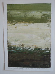
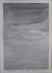
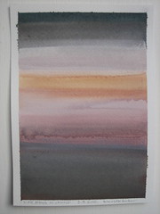
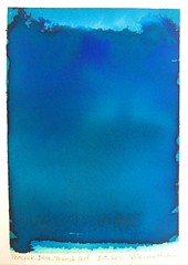
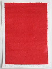
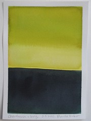
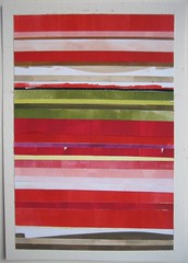
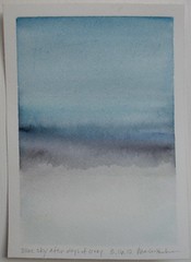
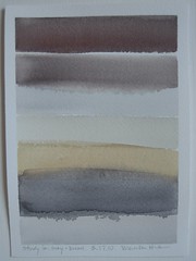
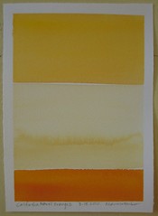
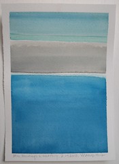
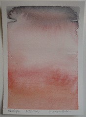
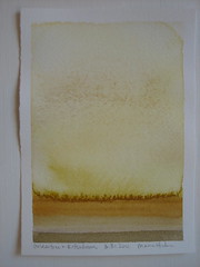
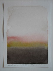
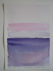
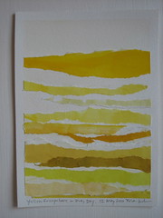
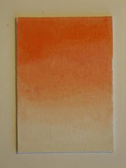
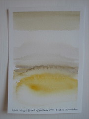
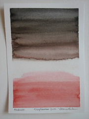
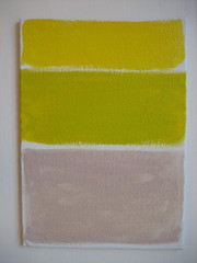
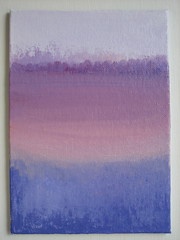
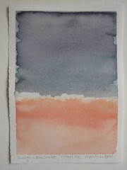
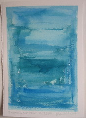
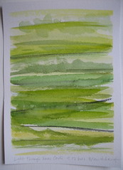
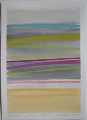
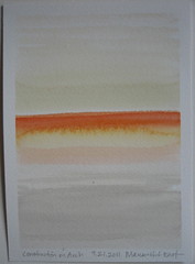
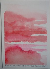
I started a color study project in February 2010.  Mike gave me the idea when I mentioned that I wanted to start oil painting but didn't know where to start.  He suggested I start small with color studies to practice mixing color and seeing how things work against each other.  The idea stayed in my head for a few months until the sunlight on a day in February was so pretty that I was compelled to start the project. I must also mention one of my favorite blog friends, Susan Lutjen O'Connor of Sulu-Design.  Her Original Intent Series is always inspiring with the photographs she translates into her beautiful jewelry.

Too many options can be paralyzing, so I set up some loose limitations on myself:

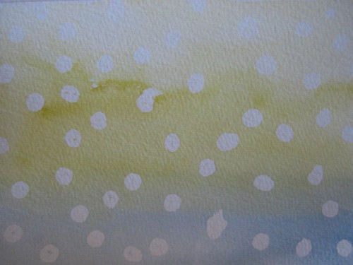
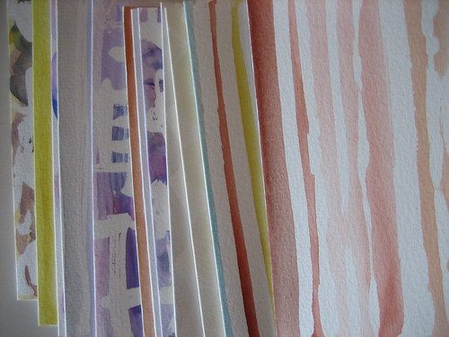
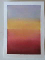
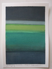
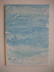
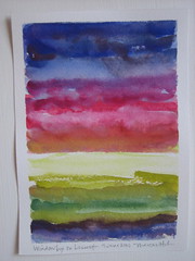
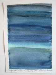
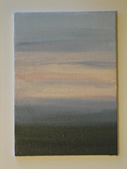
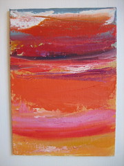
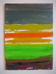
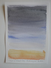
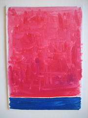
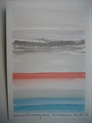
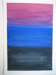
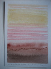
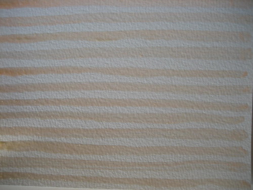
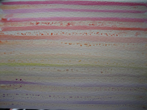
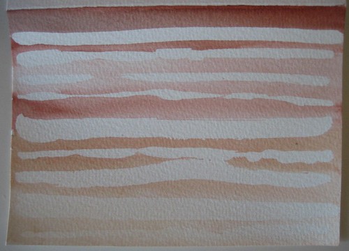
I can use any medium or technique, but can only paint colors that I've seen on that day.

If I am lazy and wait until the next day, too bad!

The format is always vertical and measures 5" x 7" on watercolor or canvas board.

My goal is to finish 100 by December 31, 2011.  Here are paintings #1 - #42.  You can click on the links to see them larger and see the descriptions.  The entire set is on my Flickr account here.

#1 Sunshine Through Begonias       #2 Green, Gray + Denim       #3 First Sign of Spring

#4 Spring Fake Out         #5 Slate Stones on Church       #6 Peacock Blue Trench Coat

#7 Shoshanna Nailpolish       #8 Chartreuse + Indigo       #9 Raspberry Jam Jar

#10 Blue Sky after Days of Gray        #11 Study in Gray + Brown       #12 California Navel Oranges

#13 Blue Buildings in West Philly        #14 Shrimps        #15 Golden Tree in Rittenhouse

#16 Spring Blooms       #17 Studies in Lilac       #18 Yellow Everwhere on a Gray Day

#22 Very Blue Sky, Big Clouds       #20 Window Box on Locust       #21 Night Sky on Girard

#21 Summer Sunset       #22 Montserrat Orange       #24 Fruit Punch + Cloth Napkin

#25 Lovely Elderly Couple Walking       #26 Whole Wheat Bread + Sunflower Seeds       #27 Andrew

#28 Hot Pink + Orange Sunset       #29 Construction at Barnes Museum       #30 Layers of Violet Sky

#31 Schnabel High Rise + Violet Blue Ladder       #32 Elle Decor on 48 Bus Home       #33 Headhouse Cherries

#34 Shampoo Violets       #35 Orange + Blue       #36 Turquoise Front Door

#37 Light Through Xmas Cactus         #38 Spray Paint on Street        #39 Construction on Arch

Roses on 27th Street          Autumn Run on Kelly Drive

#42 Indigo, Blue + Violet            #43 Walk with the Sauers

So far I'm really enjoying this project.  It makes me notice my surroundings more, and try to think of different color combinations and palettes that I usually don't gravitate towards.

I plan on ending this at the end of this year, but may do it again from time to time.

tags: acrylic, color, cut paper, gouache, oil, watercolor
categories: Color Study, Painting
Friday 10.07.11
Posted by Marissa Huber
Comments: 4
 

Lines and Chevrons

I keep blank watercolor cards and envelopes on hand at all time so that I can easily whip up cards when I need them.  With some major life events happening for a few of my friends (both good and bad, which is when blank cards come in handy for your heartfelt messages), I needed to either head over to the card store or make a large batch quickly. I went for the latter.  For quick and easy, nothing beats watercolors in my opinion.  You just need a bit of water, paper and a brush.  Having worked in a wonderful small art store during college, I can go on indefinitely about art supplies, but I'll save that for a later post.

In this case, I used masking fluid, which is like a glue that covers paper that you don't want the paint to touch, and you pull off when the paint is dry. I'm usually a frenetic sketcher who uses lots of crazy black lines, so it was good to experiment with white spaces to change it up.

Masking Fluid Production Line

After having the stunning cover image from Sarah Midda's South of France Sketchbook in my head for days, I decided to attempt my own loose interpretation with various palettes.

Masking Fluid Lines

Those who know me won't be surprised that I had to include a rainbow palettes gradating from color to color.

Rainbow Stripes

Oddly for me, since the palette above is my nearly neutral with the bright hues I love, I found myself enjoying how the peach masking fluid looked.  I particularly found myself drawn to the burnt umber and colors of the Utah landscape shown below.

Utah Colors

I also tried to edit myself with the color choices. This messy chevron card was one of my favorites.  It now has a home with one of my dearest and oldest friends in Georgia.

Messy Chevrons [After]

This polka dots card ended up being much cuter than I thought it would be.  When it comes to watercolor, you could never get the even washes of colors around the white areas without the masking fluid.

Polka Dots

I did some batik inspired cards, and a flowery one that I sent to the sweetest 11-year-old friend of mine in North Carolina to thank her for a lovely necklace she made me.

Full Set

This ended up being a lot of fun, and I achieved the result I intended; loose drawings and lines, different color combinations, some love thrown in to the end users and a bit of hot pink, but in check.

tags: color, illustration, watercolor
categories: Uncategorized
Monday 09.19.11
Posted by Marissa Huber
Comments: 3
 

Powered by Squarespace.